Case Study:
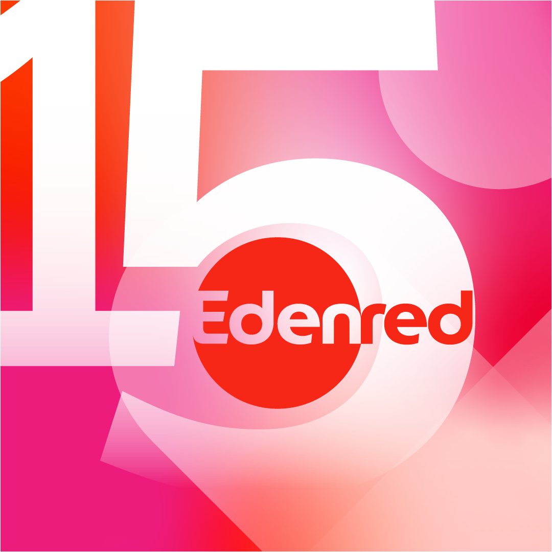
Visual Identity for Edenred's 15th Anniversary
For the celebration of Edenred's 15th anniversary, I had the honor of creating a visual identity that not only commemorates this milestone but also embodies the values of Edenred and its commitment to its employees and solution users.
Project Objectives
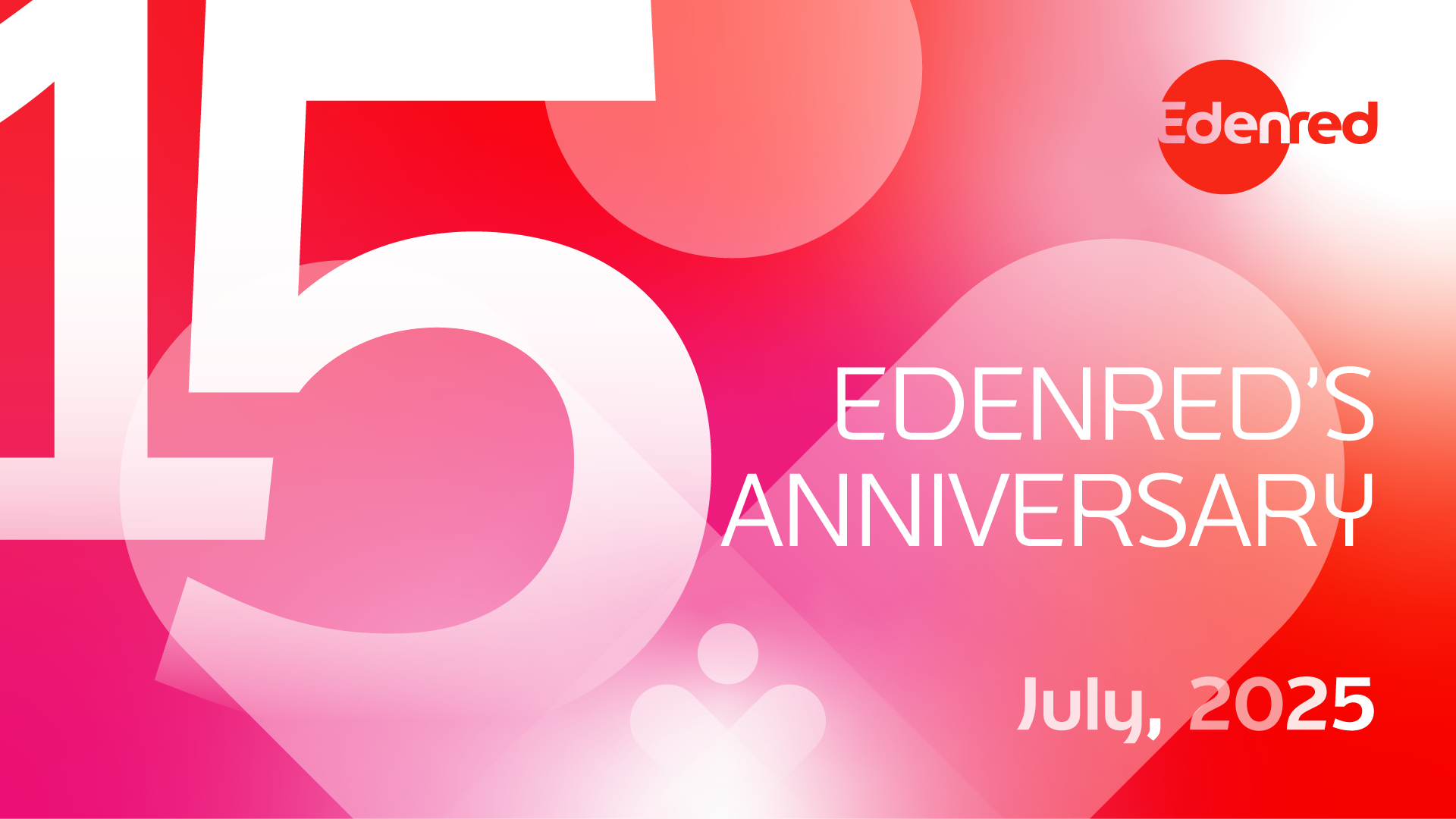
Celebrate Connections: With the theme "15 Years of Connections," the goal was to highlight the significant relationships established with solution users over the years.
Reinforce Brand Identity: To create a design that respects Edenred's graphic charter while adding a festive and memorable touch.
Creation of the Visual Identity
Concept: "15 Years of Connections"
The design was based on the core values of Edenred, emphasizing the importance of relationships. The objective was to materialize these connections through the design.
To build a strong visual identity for Edenred's 15th anniversary,
I utilized four core elements:
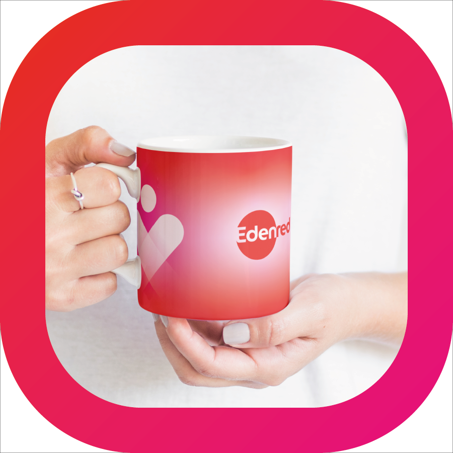
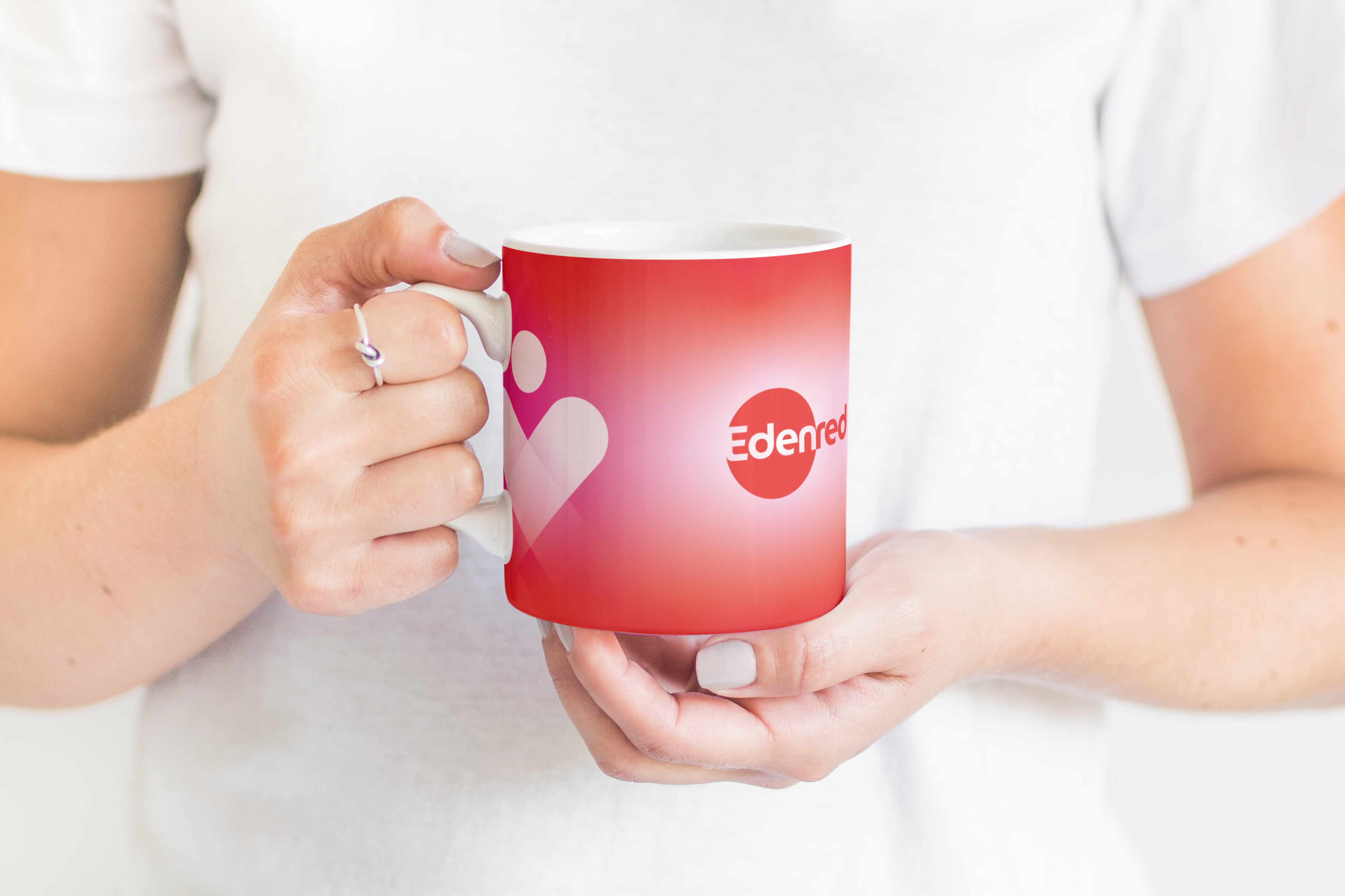
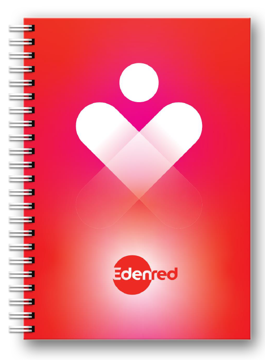
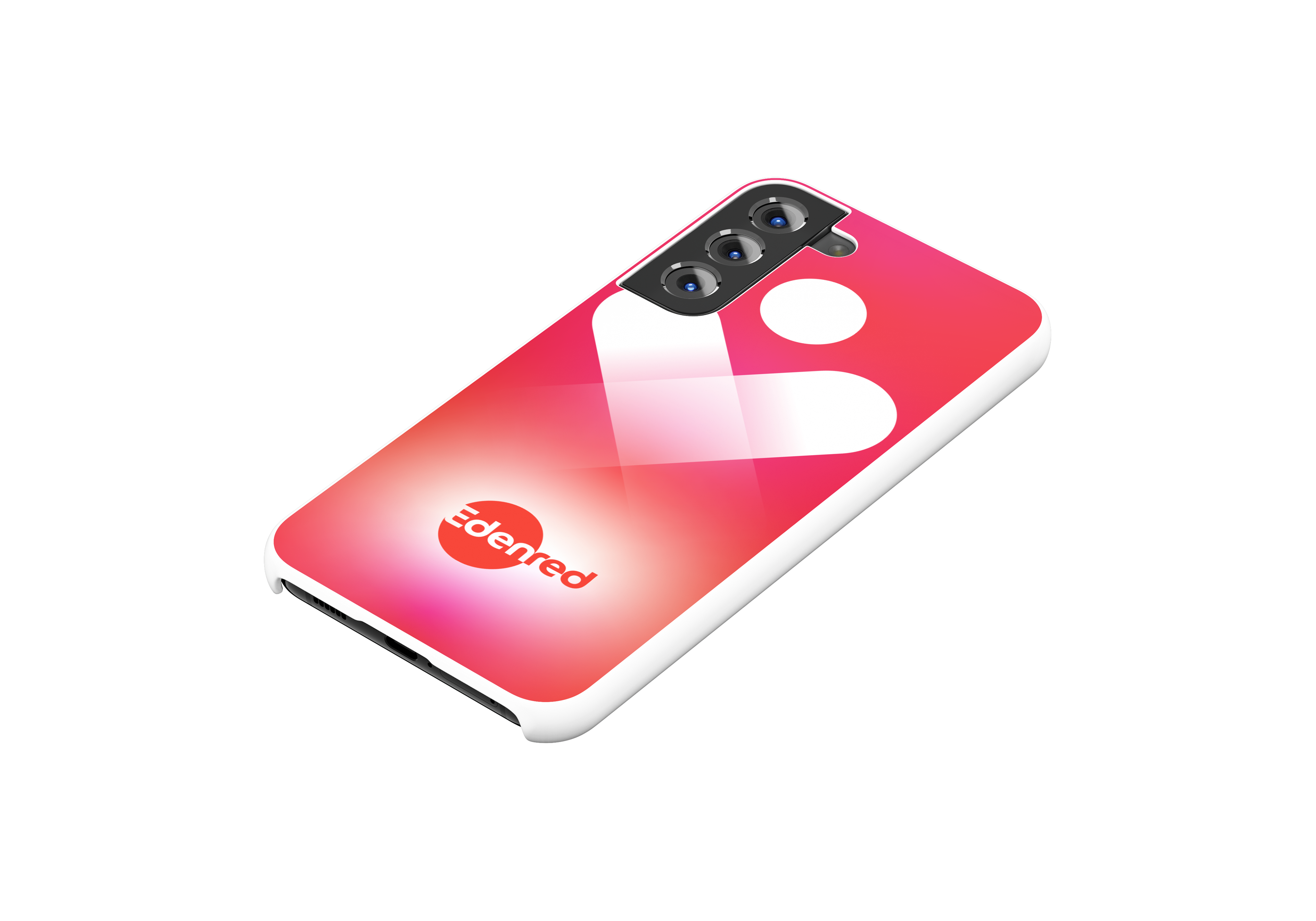
Iconography: The heart symbol represents connection and values central to Edenred, creating an immediate emotional connection with the audience.
Logo Design: The recognizable Edenred logo reinforces brand consistency and trust while maintaining a modern touch suitable for the celebration.
Typography: The selected typography adheres to Edenred's graphic charter, ensuring consistency with the existing visual identity.
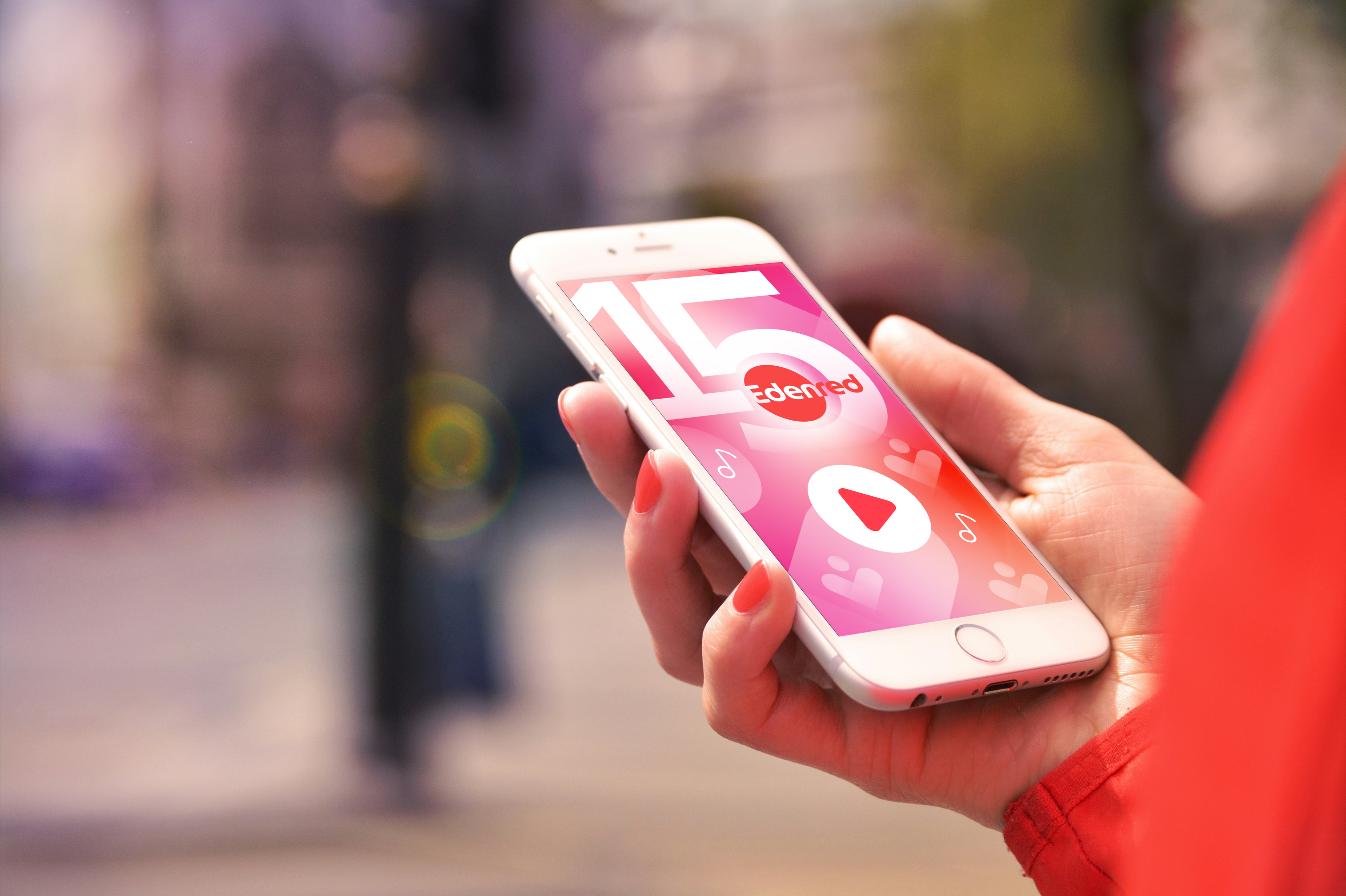
Color Palette: By utilizing red and white, which are the hallmark colors of Edenred's visual identity, I aimed to create an atmosphere that is both festive and familiar.
These elements work together to create a cohesive and impactful visual identity that resonates with stakeholders.

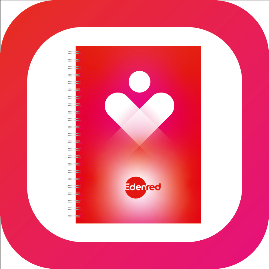
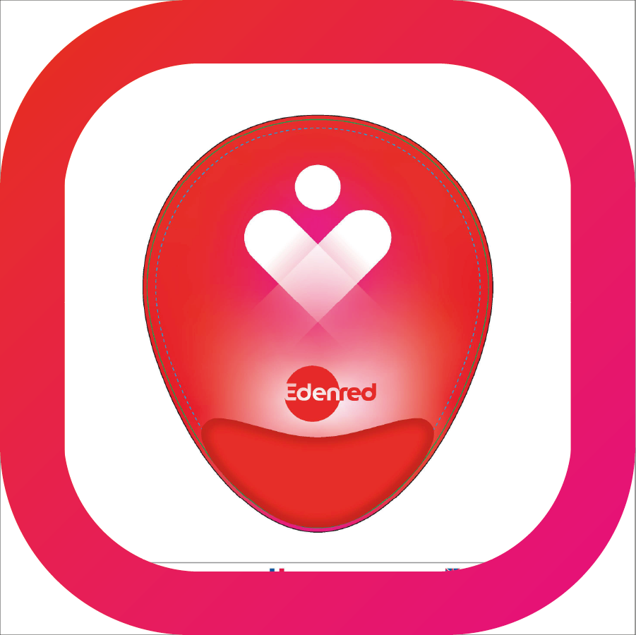
Illustration of the Heart Figure:
I designed a character formed by the overlapping of ribbons that create the shape of a heart.
This concept represents:
Edenred Employees, showcasing their passion and commitment to the company.
Solution Users, who are essential to Edenred's mission.
This symbolic heart evokes the idea that users are at the core of all actions.


Application & Adaptation
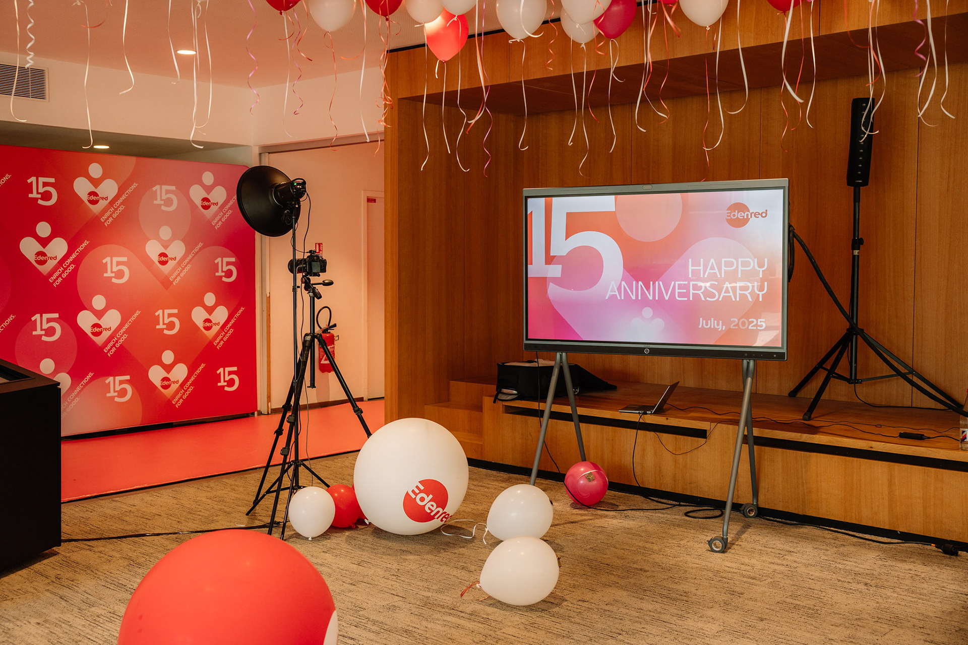
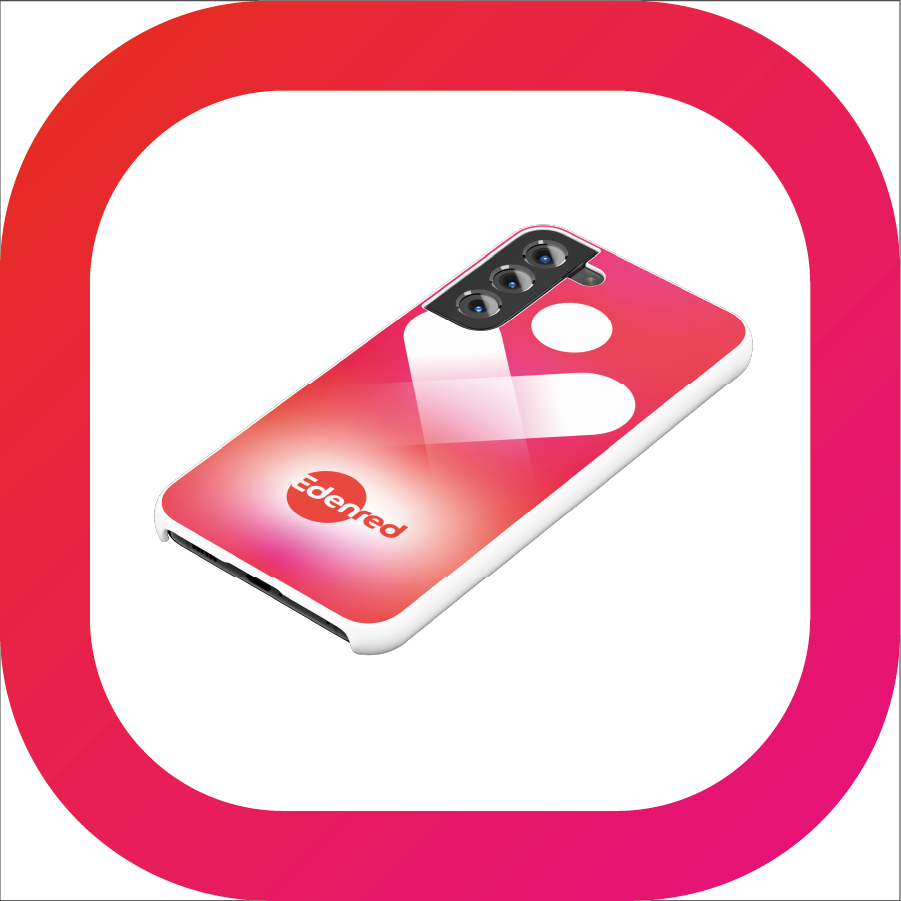
I applied this visual identity across various platforms, including:
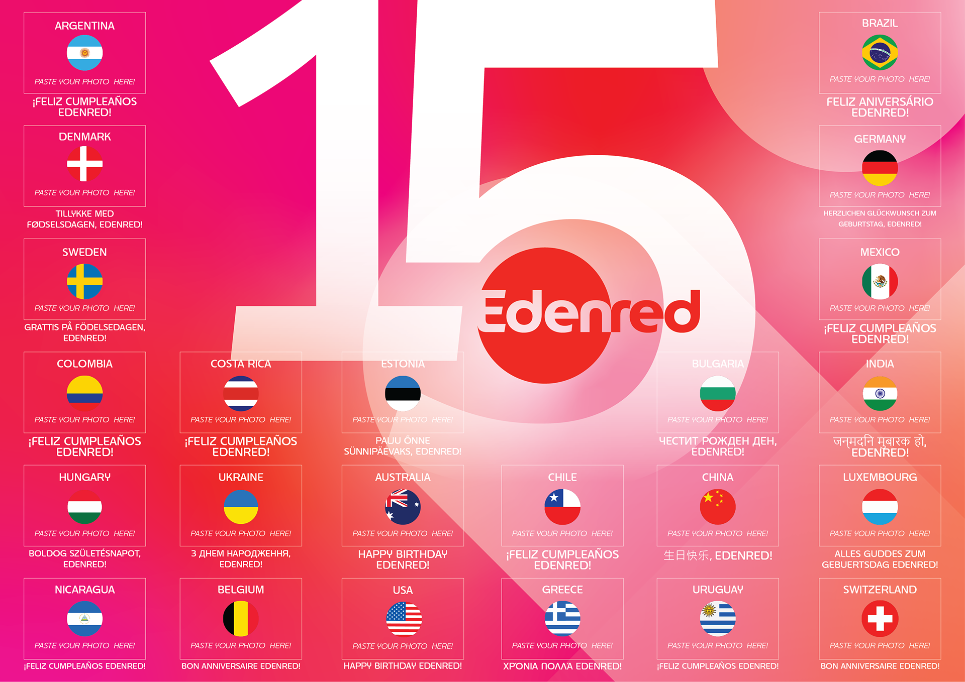
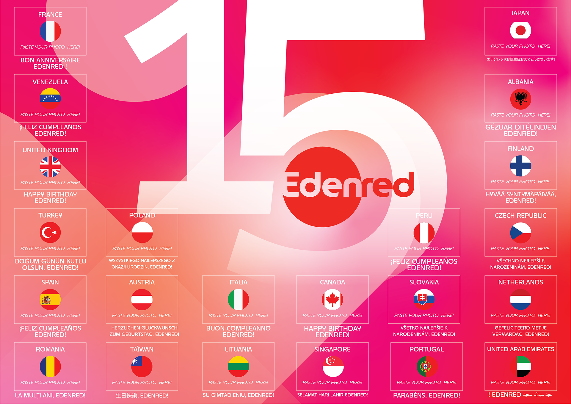
Ready-to-Adopt Toolkit: I created a toolkit that was made available on our Brand Center for 45 countries. Each country was able to adapt this visual for their language and local devices, ensuring coherence while respecting cultural diversity.
Digital Communication Items: Including emails, screensavers, and other digital assets.
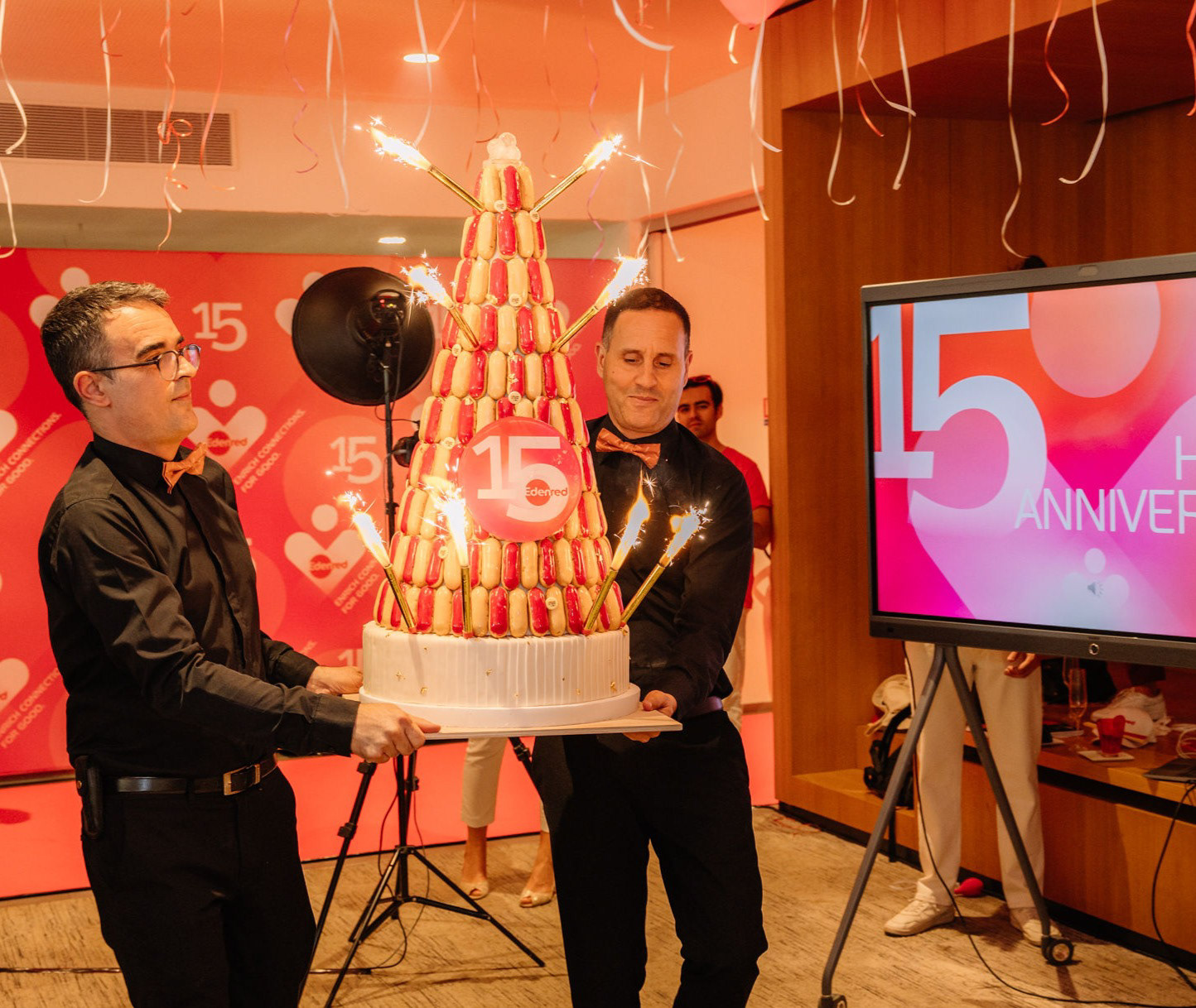
Promotional Items: Designs for merchandise such as sunglasses, fans, cakes, and posters.


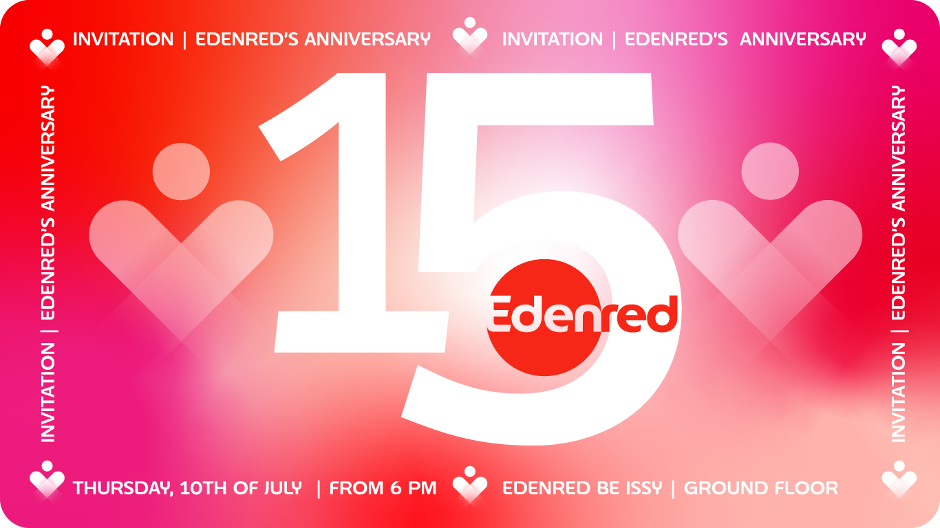
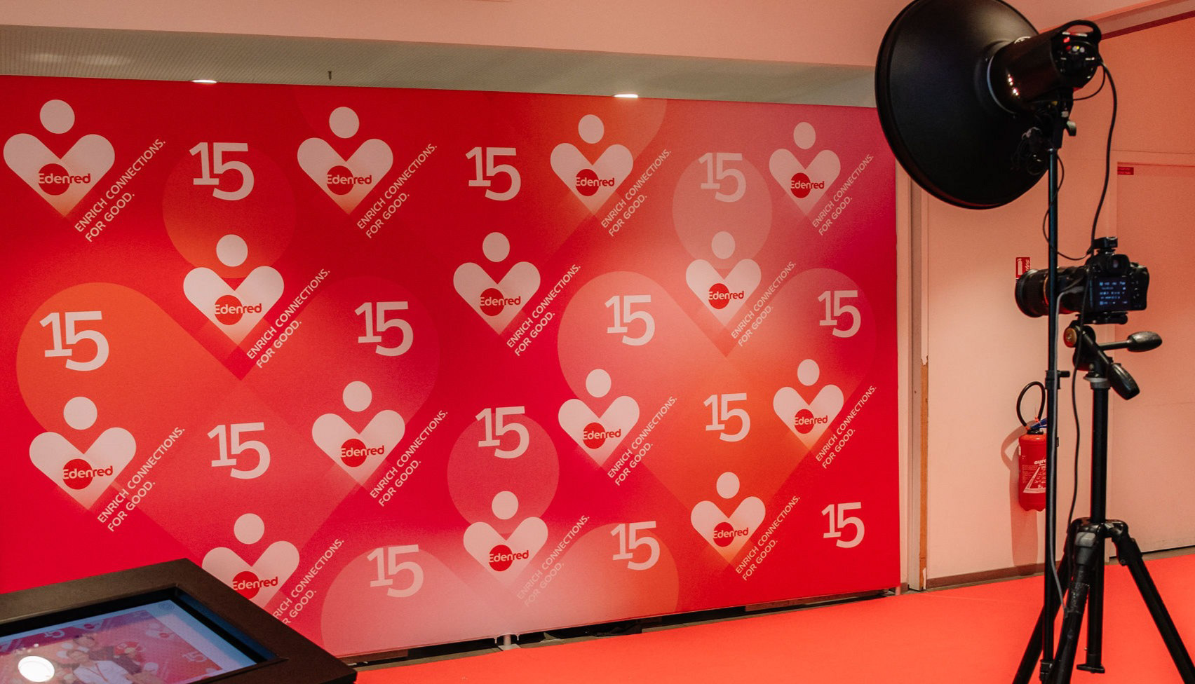
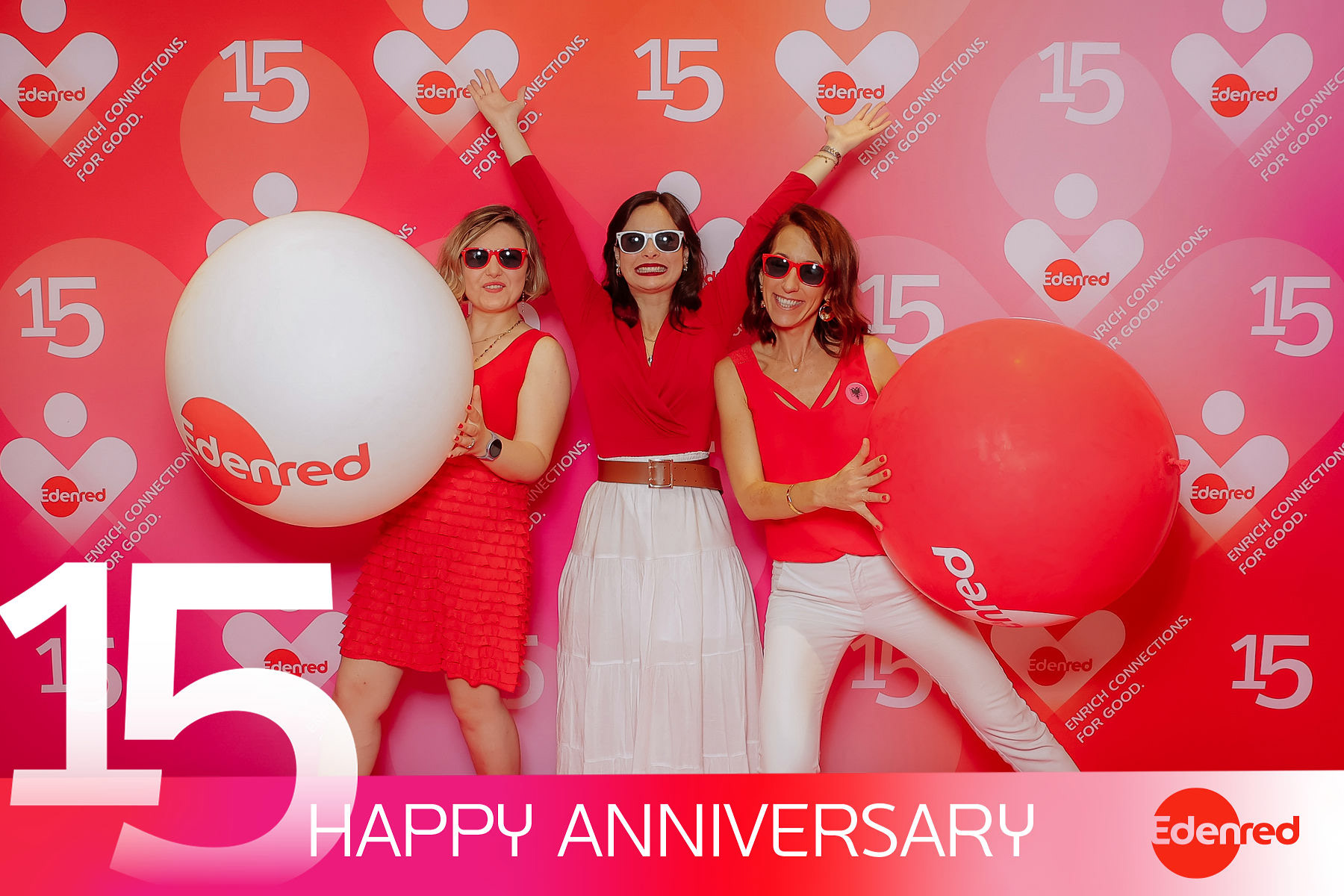
Print Communication: Photocall and photobooth designs.
Results and Feedback
The feedback from employees has been overwhelmingly positive. The visual identity successfully captured the essence of the celebration and symbolized the connections established over time.
This project was a wonderful opportunity to merge creativity and strategy while reinforcing Edenred's identity. The heart figure illustration added a playful touch and highlighted the core values of the company, which are humanity and connection with users.
Thank you for passing :)
If you're interested in bringing a unique and memorable event to life, tailored to your brand's image, feel free to contact me.
DA: Nana TOTOSASHVILI
Design graphic: Nana TOTOSASHVILI
All rights reserved: Edenred